Copyright Notice

© Copyright 2023 Brenda Swenson retains copyrights to all images (artwork and reference photographs). All images on this site are property of Brenda Swenson and may not be used in any way for commercial, financial or personal use without written consent. Brenda Swenson retains all rights to republication (printed and digital) and anything but personal viewing of artworks. www.SWENSONsART.net
Showing posts with label Art Supplies. Show all posts

Wednesday, February 27, 2019

Framing Art Without Glass

Lately I’ve been looking into framing options. I don’t always want to use a mat, glass/acrylic. I am entering more shows that have oils and acrylics. These show do not have the same standards as watercolor societies and do not require a mat or glass/acrylic.

A word of WARNING…Most watercolor societies DO NOT allow a painting with any kind of varnish in a show. If you decide to explore these options you may not be able to enter the painting in a desired show…do your homework first!


CLAYBORD
After reading an article in Watercolor Artists Magazine I realized Claybord might have more possibilities that I thought. The product is made by Ampersand and has been around for a while. Claybord comes in a couple different surfaces.

Let me show you what I learned. I did two small pieces to explore the surface. I used the 5 x 7 Claybord, Textured. I used my inexpensive brushes since the surface felt rougher then watercolor paper. And the surface isn’t absorbent so I didn’t need a brush that held a lot of water.


The rooftop scene in Santa Barbara was done by wetting the Claybord first and letting the paint float on the surface in the same fashion as wet into wet. The surface does not absorb like watercolor paper and it takes longer for the surface to completely dry. It has interesting qualities that I like. 

 With the Persimmons I left a lot of the Claybord untouched and let the white of the Claybord exposed. I like how the paint moved on the surface and the colors remained bright. The surface has very little absorbency so the paint remains on the surface. It was easy to glaze on and get the results I wanted. I specially like how easy it was to lift paint and reclaim whites.


KRYLON UV - RESISTANT VARNISH (Matte or Glossy)
It’s important to seal the surface so the image has a barrier from the elements (dirt, smoke…) and light. I used KRYLON UV-Resistant, Acrylic Coating. I applied 3 or 4 coats. Let thoroughly dry between coats.
 In the video below you can see a side by side comparison of the matte and glossy finish.


You can stop here or go one step further.  My painting “Kettles & Cups” (below) has the addition of Dorland’s Wax. Read below…

DORLAND’S WAX
When I want a special finish I use Dorland’s Wax. It is non-yellowing and adds a soft glow to the surface.


Step #1 Seal surface of painting with a couple light coats of UV-Resistant acrylic varnish
Step #2 Scoop out a small amount of wax with a lint free cloth and apply it in a circular motion.  As soon as your cloth "drags", scoop out more wax.
Step #3  Allow coat to dry 24 hours.
Step #4  Using a clean, dry and lint free cloth, buff the surface.  You'll see a very slight sheen.
Step #5 Apply a second coat, let dry 24 hours and buff to a slight sheen.


Kettles & Cups

There's a lot of information available on the internet when it comes to researching products. I won’t pretend to know it all but I can share what I’ve learned along the way.


***
Have you seen the April issue of Watercolor Artist Magazine? I have an article called "All Toned Up". You'll see my demonstration that became the painting above, "Kettles & Cups". Hope you check out the issue and read my complete article.
The painting was selected to be in the California Art Club, Gold Medal Exhibition. Opening reception this weekend. I've been busy!


Happy Painting!

Brenda

Monday, January 14, 2019

Ink Testing

Ink Swatches to Test
I have sketched with ink for years. About 10 years ago I switched over to fountain pens because of the varied sizes of pens in my hands and the multitude of nibs available. I like the variety of lines that can be created with nibs of different widths and materials. I’ve enjoyed using fine, extra fine, medium, broad, italic, flex, music nib and more. But let’s save this topic for another day. 

When it comes to ink color I like anything but…black. The brands and colors I like come in bottles. I like light grey, brown and sepia tones. I have a few water soluble inks but I mostly use waterproof ink. 

I’ve read discussions on Facebook about different inks and how they react to sunlight, archival quality and whether they’re waterproof, semi waterproof or water soluble. As you know…If you ask a question on a public forum you'll get many opinions but not necessarily the correct answer. I did a little reseach on my own and found it challenging to find the information. I was searching for the lightfast and archival qualities of the inks.  

Lightfast: Not prone to discolor or fade when exposed to light.

Archival: pH neutral and acid free.

Materials Needed
I decided to do my own tests.
To start with, I made swatches of ink on 4"x 2" inch cards of 140lbs cold press (not) watercolor paper. When dry I covered half the swatch with another piece of watercolor paper. I put the swatches in a plastic sleeve and taped against a window for 30 days. These tests were done during the summer, 2018.

I made a short video showing the results of my tests. One of my favorites didn't pass the test...but I was pleasantly surprised by many others. Hope you find this information helpful. To be clear Lightfast: not prone to discolor or fade when exposed to light. Archival: Is pH neutral and acid-free. 

One of my favorite waterproof inks (water resistant) is the De Atramentis, Document ink. They have a wide assortment of colors that can be mixed.The De Atramentis Document Ink can be found at Goulet Pens.com. I like mixing the Brown and Red and then lighten a little with the De Atramentis Document Solution. Perfect sepia color!

To see all the results check out this short video by clicking on the image below or following this link:  Ink Testing Video

Happy Sketching!
Brenda

Tuesday, August 14, 2018

Fountain Pens: The Beginning

I have been sketching for 20+ years. Drawing with pen requires I spend more time looking and observing. When I put the pen to paper I do it with a greater sense of awareness. I spend more time looking at my subject. Since I can’t erase I slow down and pay more attention to how I’m holding the pen, the pressure, the speed, the ink flow… All of these things mean I’m more involved with the experience. I draw slower and with a greater awareness. 

About 7 years ago I wanted a pen that would do more than simply get the job done. I’d grown tired of cheap pens and wanted something that was enjoyable to hold, look at and responsive to my touch when sketching. I started exploring fountain pens. Little did I know how big the fountain pen world was...I was lost! So many new terms, filling mechanisms, ink, nibs… That's when I stumbled upon Goulet Pens. At last I was able to make sense of all the terms, option, nibs, inks... The company is amazing, website is great, technical support, videos, how to, tips and great prices!

At his point I’ve got to say, I love sketching with fountain pens BUT I'm hesitant to recommend specific brands when asked. It's difficult to know a person's skill level, if they’re hard on things, personal style, price range…and nib size. Goulet Pens are some of the best folks I know for: information, tutorials, videos...and purchasing pens.

If you're new to the pen world or even if you've been around for a while I think you'll find this video very helpful, I did! Fountain Pen Nib Size Overview 

My first fountain pen was a LAMY Safari. At $30.00 these pens are great starter pens and won’t break the bank. You can even buy replaceable nibs. Last time I looked LAMY replaceable nibs were $15.00. You use ink cartridges or bottled ink. You’ll need the cartridge adapter for bottled ink. It's a good pen to learn with and you’ll also learn how to care for a fountain pen. Yes…fountain pens require care. 
My next fountain pen was a step up. The Pilot Falcon (previously known as the Namiki Falcon) is an iconic pen. It’s most famous for its 14k gold soft nib, which provides line variation with your writing/sketching pressure. The pen is wonderfully responsive and gives line width variation. 


Sketch of my LAMY Safari and Pilot Falcon
When (and if) you decide to move up in the fountain pen world you’ll want to view this video. Top 5 Entry-Level Gold Nib Pens

And then I was in Italy…Florence to be exact.
I was scheduled to teach two workshops in Lucca. Before the workshop I spent a fews days in Florence sketching and painting. I was staying at a hotel just walk across the Ponti Vecchio on the right hand side at the first street. My room over looked a sign that said, PINART. Now 
seriously, did you think I would pass without going in? Once inside, I met Federico Pineder, the shopkeeper. He was friendly, knowledgeable and let me try a few many pens. If you’re ever in Florence be sure to visit PINART


Did I buy a pen that day? Of course...a beautiful Visconti, Rembrandt, pearl white. And that's the beginning of another story...

Happy Sketching!
Brenda

Wednesday, November 29, 2017

Negative Painting - Poinsettias


Reference Photo 
Cameras are a wonderful tool but it's important to remember photographs are simply a springboard. I don’t rely too heavily on them. The sooner I respond to what’s happening on the paper and quit looking at the photo the better off I’ll be…especially with the technique of negative painting.

1: DRAWING 
I start by drawing the poinsettias with a 2B pencil on Arches 140lb cold press paper. I'm especially aware of the space and shapes between the flowers and leaves (negative space). I want shape and size variety. I draw enough to get the general shapes, but not too much. I intentionally leave areas understated so I'll have opportunities for negative shapes to develop in the painting process. 


MOTHER COLORS
I use transparent paint to build up glazes. I limit my underpainting to 3 

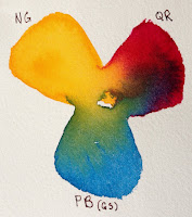
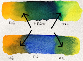
colors. To determine which 3 colors I will use I make numerous color swatches. The paints need to be the same consistency (whole milk) to encourage ample mixing on the paper. I'm looking for interesting combinations (how they mix when wet, range of colors, range of values and do they relate to my subject). The 3 paint colors I selected I call my Mother Colors: New Gamboge (NG), Quinacridone Rose (QR), and Phthalo Blue GS (PB GS).


2: UNDERPAINTING
I wet the watercolor paper with clean water and introduce the 3 paint colors separately into the wet surface. I paint at an angle to encourage mixing as the paint moves. I don’t overwork the surface with a paint brush but encourage the paint to mix and mingle on the paper. I leave a third of the paper untouched with paint. As it dries the paint will continue to move and hopefully a small amount of light/whites will remain. Let throughly dry naturally (without a hair dryer).

3: START GLAZING
I continue with my Mother Colors (original 3 colors) and I pull French 

Ultramarine into the mixing area of my palette. When I bring a new color into the mix it touches one of the original Mother Colors. Why? Having a new color touch one of the original 3 colors creates harmony in the glazing process. When I begin glazing I'll paint over some of the poinsettia petals, leaves and background at the same time. I start in the upper left hand corner and work clockwise. I paint hard edges against the petals I want to save and soften as I pull away. As I work clockwise around the main poinsettia I vary my colors slightly with the Mother Colors and French Ultramarine. Let throughly dry.


4: GLAZING CONTINUED - GREENS
Periodically I wipe off my palette especially if the mixing area has become a neutralized mixture. Mud, neutrals or grays are wonderful and every painter should know how to mix them. But know when you want them and how these grays work to make other colors more lively.

I pull out fresh paint into the center of my palette. I have the Mother Colors (NG, QR, PB), French Ultramarine and the new addition of Hansa Yellow Light. Starting on the left side directly below the poinsettia and working counter clockwise. I use a mixture of French Ultramarine & 

Quinacridone Rose. I carve out shapes with hard edges against the petals. As I move across the lower section I want my colors to move from purples into the greens. With each brush load I slightly shift the green. Below the center poinsettia is a cooler green and pushes towards the blues. As I move across the lower section (left to right) I carve out more petal shapes. Above the far right poinsettia the greens are much warmer and have more Hansa Yellow Light. The small negative shapes in the center of each flower is a dark mixture of French Ultramarine & Quinacridone Rose. Let throughly dry.


FINAL STAGE: DARKEST DARKS, SMALLEST SHAPES & DETAILS
As the poinsettia turns from the light I have a variety of shadows. Form shadows have soft edges and cast shadows have hard edges. The shadows on the petals are a darker value of Quinacridone Rose with a touch of French Ultramarine as it turns from the light. When I need to soften the edge of a form shadow I use clean water on the edge before the paint has a chance to dry. The leaves beneath the center poinsettia is the darkest passage of negative painting. I use a mixture of Phthalo Blue GS & New Gamboge, before the paint has a chance to loose its shine I drop a little Quinacridone Rose into the passage. The unexpected warmth brings life to the dark greens. A few touches of color in the center of the poinsettia and it’s finished.


CONCLUSION
Hope you’ve enjoyed this short demonstration. I used the Daniel Smith Essentials SetThe set consists of six tubes of paints. A warm and cool: red, blue and yellow. The colors are VERY transparent (exception of Hansa Yellow Light which is semi-transparent). 

Happy Painting!
Brenda

Monday, October 23, 2017

Walnut Ink & Watercolor

Autumn brings with it a beautiful array of colors and textures. At our Farmer’s Market a
new crop of persimmons are available in a variety of shapes and colors.  I came home with a bag full and put them in a favorite dish. I loved how the contrast of colors and textures played off of each other: orange-red against blue-green. Smooth against rough.

When Daniel Smith Artists’ Materials asked if I’d like to try their Walnut Ink. I was eager to give it a try. I am particularly fond of inks with warm tones. The idea of drawing the persimmons with walnut ink was appealing. Before the bottle arrived I did a little research on their website. I thought walnut ink would fade. I was wrong. Here is what I found.

“DANIEL SMITH Walnut Ink is lightfast, non-acidic, transparent, and low staining.  It’s finely pigmented, sepia-colored, water-based ink made from walnut husks. It's great for all types of drawing styles and calligraphy, and works beautifully with a dip pen or brush. With a brush, DANIEL SMITH Walnut Ink handles like a transparent watercolor with good layering, and lifting capabilities in darker washes. The rich color resembles traditional walnut-based inks, but will not fade.” 

Step 1
Watercolor Paper is Bockingford cold press 140lb. My favorite technique for drawing is continual line contour. I keep my pen on the paper for the majority of the drawing. I am using a bamboo reed pen…Why? I enjoy line variation.
Helpful hint: Before you begin drawing soak the tip of the bamboo reed pen in 3 inches of water for 20 minutes.  The pen will have an increased ability to hold ink.


Step 2
I start by pulling fresh color into the center of my palette. I work on a dry surface and mix the colors on the paper. You’ll noticed the Walnut Ink moves…I like that. If I touch the line gently it will move a little and more if I scrub the line with my brush the more it moves.  
The persimmons are a mixture of Hansa Yellow Medium, Anthraquonoid Scarlet & Quinacridone Burnt Orange. The Leaf and stems are Quinacridone Gold & French Ultramarine.


Step 3
The plate is painted with Cobalt Teal Blue. I intentionally disrupted the details on the plate with my brush. I want the lines to defuse. I don’t want the lines to be in sharp focus especially since the majority of the plate will be effected by shadows from the persimmons.


Step 4
Shadows are my favorite subject! The presence of light defines form and gives life to a subject. I begin my making two puddles of paint on my palette: 1. Quinacridone Burnt Orange & Quinacridone Rose 2. Imperial Purple. I start by painting the form shadows on the persimmons with Quinacridone Burnt Orange & Quinacridone Rose and quickly move into the cast shadows on the plate with Imperial Purple. I want a soft transition between the objects and the colors.


Step 5
The final stage I use Imperial Purple in the background. Before the passage has lost its shine I touch a small amount of Phthalo Turquoise into the area. Final touches are added to the foliage area.


My Daniel Smith dot card has a white X on the colors I used for this piece. All the materials used in this demonstration are listed below. 

Ink: Walnut Ink (new bottle same ink)
Watercolor Paper: Bockingford 140lb cold press


Happy Painting!
Brenda


Wednesday, July 5, 2017

Modified Watercolor Palette

I’ve always liked to take things apart (disassemble). When I was a kid... if I really liked something I took it apart. Why? I wanted to know how it was made. And yes I always put things back together. I have continued my fascination with how things are made into adulthood. But now I usually take things apart to see how I can make it better.

I’ve modified most of my art supplies: Sketch-Bag, sketchbooks, brush holders, pen holder, a few easels…and lots of palettes.

I get lots of questions about my sketching palette because it looks
different. I modified it, too. The palette goes by many names but the same thing: Heritage, Alvin, Mijello. It’s a great palette but lacks an area to make contained puddles for washes.

Supplies: 
Palette: 18 well folding
Trays:  3 inch Triangle Bead Trays, plastic (easily found on internet search)
Glue: Gorilla Glue or Epoxy 
Sandpaper: Fine Tooth/Grit


Instructions:
Clean the inside of the palette surface and allow to dry.
Use a fine grit sand paper on the bottom of the trays for better adhesion. 
Use a small amount of glue on the trays and put into place. 
Leave palette open over night to dry.


Step-by-Step VideoModified Watercolor Palette. If video doesn't play click this link: Video

And what would a palette be without paint? Here's my Dot Card of paint choices. I use Daniel Smith Watercolors. In my sketch palette you'll notice I've added Green Gold and eliminated Phthalo Blue (GS). These colors are on my studio palette which has more wells. Wish I could send everyone a Dot Card but I only have enough to cover workshops...sorry. 


Daniel Smith Watercolors 

Green Gold (not seen on card)
Hansa Yellow Medium
Raw Sienna Light
Quinacridone Gold
Permanent Yellow Deep
Anthraquinoid Scarlet
Permanent Alizarin Crimson
Quinacridone Rose
Imperial Purple
French Ultramarine
Phthalo Blue GS
Cobalt Blue
Manganese Blue Hue
Cobalt Teal Blue
Phthalo Turquoise
Green Gold
Phthalo Green (BS)
Quinicradone Burnt Orange
Transparent Red Oxide (or Burnt Sienna, Winsor & Newton)
Lunar Black
Lavendar (not seen on card)
Buff Titanium (not seen on card)


Monday, February 27, 2017

Don't Carpet Your Rut #2


Any form of repetition can be a rut: technique, subject matter, perspective, lighting or paint colors.  The quote, “Don’t carpet your rut”, reminds me not to get too comfortable doing the same thing. Painter’s can get in a rut because we want a successful outcome every time. Anything that’s repetitive is playing it safe. If you want to grow it means you have to take a risk. The risk can be large or small. 

If you find yourself in a creative rut…start climbing out! I begin by thinking, What if? How many ways can I sketch or paint a subject differently? The answer is countless.

The more effort and imagination I put into exploring a new approach the better the experience will be. The object can be quite simple.  The images don't need to be very big, 4x6 or 5x7 inches will do. I sketch the subject numerous times mixing drawing and painting techniques. This is a great way to explore new ideas by investing a small amount of time.

Pens: Bamboo Reed, Fountain, Disposable, Ballpoint…
Ink: waterproof , soluble, colored…
Drawing Tools: Pencil, Charcoal, Markers, Brush…
Papers: Watercolor (cold or hot press, rough) pastel paper, Japanese papers…
Paint Colors: Regular Palette, Triads, Tonal, Warm or Cool… 
Painting Techniques: wet-into-wet, flat or graduated washes, glazing…

The examples are numbered in order completed. Each drawing took less than 3 minutes and were painted in 10 minutes or less. For me it is important to keep the exercises quick and fun.


#1 Drawn with a bamboo reed pen dipped in liquid watercolors. Painted with regular palette of Daniel Smith Watercolors.

#2 Drawn with a fountain pen dipped in sepia waterproof ink. Value study with sepia pencil and painted with Lunar Black.

#3 Drawn with pencil. Painted with regular palette and Payne’s Blue Gray. The new Payne’s Blue Gray mixed beautifully to create rich glowing darks in the background.

#4 Drawn with a fountain pen with blue waterproof ink. Painted with the 8 new colors from Daniel Smith.  I love putting these new colors to work!

Now it’s your turn. Once you start, you’ll see endless possibilities. I’m sure you can add a few of your favorites to the list! See more examples here.

Happy Sketching! 
Brenda

Thursday, November 17, 2016

The Perfect Sketch Bag


I'm an organized person by nature and the idea of having everything I need in an organized bag delights me to no end. I keep my sketch bag packed and when I get a chance to sketch I grab the bag and go. No need to worry about forgotten items. 

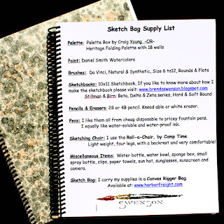
Over the years I have refined the set-up and it works for me. I use a “Rigger Canvas Bag” I found at a tool store called Harbor Freight (they no longer sell the bag but I've seen similar bags at Home Depot and garden shops). I've made a few alterations to the original bag.  I took out some stitching to open up the pockets on the sides, put cardboard inside on the bottom for added support and a shoulder strap. Now my pens, brushes, palette, sketchbooks…fit snuggly. You just can’t beat it! 

I have been carrying a sketch bag around for so long friends have nicknamed it the “Brenda Bag”. I use my Sketch Bag when I travel across the country and overseas. I simply take everything out, roll up the bag and put it in my carry on luggage. Yes, I carry my palette on the plane. I leave it open for a couple days so the paint will harden and put in a plastic bag. 

The sketch bag has become like a old friend. We have traveled across the U.S. countless times…to Prague, Germany, France, Tuscany…by car plane, train…

If you wish to learn more about my larger 10x11 sketchbook, read the "Perfect Sketchbook".

Would you like to know what I keep in the bag? Here's my Youtube video. Click on my Sketch Bag to view the video.

If you have a problem viewing the Youtube video paste this link in your browser. https://youtu.be/iKsme0wedDk 

Happy Sketching!   
Brenda