Reference Photo
Cameras are a wonderful tool but it's important to remember photographs are simply a springboard. I don’t rely too heavily on them. The sooner I respond to what’s happening on the paper and quit looking at the photo the better off I’ll be…especially with the technique of negative painting.
I start by drawing the poinsettias with a 2B pencil on Arches 140lb cold press paper. I'm especially aware of the space and shapes between the flowers and leaves (negative space). I want shape and size variety. I draw enough to get the general shapes, but not too much. I intentionally leave areas understated so I'll have opportunities for negative shapes to develop in the painting process.
MOTHER COLORS
I use transparent paint to build up glazes. I limit my underpainting to 3
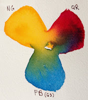
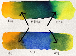
 colors. To determine which 3 colors I will use I make numerous color swatches. The paints need to be the same consistency (whole milk) to encourage ample mixing on the paper. I'm looking for interesting combinations (how they mix when wet, range of colors, range of values and do they relate to my subject). The 3 paint colors I selected I call my Mother Colors: New Gamboge (NG), Quinacridone Rose (QR), and Phthalo Blue GS (PB GS).
 2: UNDERPAINTING
I wet the watercolor paper with clean water and introduce the 3 paint colors separately into the wet surface. I paint at an angle to encourage mixing as the paint moves. I don’t overwork the surface with a paint brush but encourage the paint to mix and mingle on the paper. I leave a third of the paper untouched with paint. As it dries the paint will continue to move and hopefully a small amount of light/whites will remain. Let throughly dry naturally (without a hair dryer).
3: START GLAZING
I continue with my Mother Colors (original 3 colors) and I pull French
 Ultramarine into the mixing area of my palette. When I bring a new color into the mix it touches one of the original Mother Colors. Why? Having a new color touch one of the original 3 colors creates harmony in the glazing process. When I begin glazing I'll paint over some of the poinsettia petals, leaves and background at the same time. I start in the upper left hand corner and work clockwise. I paint hard edges against the petals I want to save and soften as I pull away. As I work clockwise around the main poinsettia I vary my colors slightly with the Mother Colors and French Ultramarine. Let throughly dry.
 4: GLAZING CONTINUED - GREENS
Periodically I wipe off my palette especially if the mixing area has become a neutralized mixture. Mud, neutrals or grays are wonderful and every painter should know how to mix them. But know when you want them and how these grays work to make other colors more lively.
I pull out fresh paint into the center of my palette. I have the Mother Colors (NG, QR, PB), French Ultramarine and the new addition of Hansa Yellow Light. Starting on the left side directly below the poinsettia and working counter clockwise. I use a mixture of French Ultramarine &
 Quinacridone Rose. I carve out shapes with hard edges against the petals. As I move across the lower section I want my colors to move from purples into the greens. With each brush load I slightly shift the green. Below the center poinsettia is a cooler green and pushes towards the blues. As I move across the lower section (left to right) I carve out more petal shapes. Above the far right poinsettia the greens are much warmer and have more Hansa Yellow Light. The small negative shapes in the center of each flower is a dark mixture of French Ultramarine & Quinacridone Rose. Let throughly dry.
FINAL STAGE: DARKEST DARKS, SMALLEST SHAPES & DETAILS
As the poinsettia turns from the light I have a variety of shadows. Form shadows have soft edges and cast shadows have hard edges. The shadows on the petals are a darker value of Quinacridone Rose with a touch of French Ultramarine as it turns from the light. When I need to soften the edge of a form shadow I use clean water on the edge before the paint has a chance to dry. The leaves beneath the center poinsettia is the darkest passage of negative painting. I use a mixture of Phthalo Blue GS & New Gamboge, before the paint has a chance to loose its shine I drop a little Quinacridone Rose into the passage. The unexpected warmth brings life to the dark greens. A few touches of color in the center of the poinsettia and it’s finished.
As the poinsettia turns from the light I have a variety of shadows. Form shadows have soft edges and cast shadows have hard edges. The shadows on the petals are a darker value of Quinacridone Rose with a touch of French Ultramarine as it turns from the light. When I need to soften the edge of a form shadow I use clean water on the edge before the paint has a chance to dry. The leaves beneath the center poinsettia is the darkest passage of negative painting. I use a mixture of Phthalo Blue GS & New Gamboge, before the paint has a chance to loose its shine I drop a little Quinacridone Rose into the passage. The unexpected warmth brings life to the dark greens. A few touches of color in the center of the poinsettia and it’s finished.
CONCLUSION
Hope you’ve enjoyed this short demonstration. I used the Daniel Smith Essentials Set. The set consists of six tubes of paints. A warm and cool: red, blue and yellow. The colors are VERY transparent (exception of Hansa Yellow Light which is semi-transparent).
Happy Painting!
Brenda


Thank you! Hope to try!
ReplyDeleteThank you! What a fun project for the holidays.
ReplyDeleteOh my...! Just arrived in the mail yesterday, this very set of Daniel Smith watercolors... It was on back order and I had waited a good month for them. I've wanted to experiment & play combining good quality primary colors to for my secondary colors.
ReplyDeleteThank you for my new inspiration!
Blessings...
Cheryl, Wow...perfect timing!
DeleteWow, Brenda...your kindness in sharing this with your blog followers is amazing.
ReplyDeleteAs always a splendid example of negative painting and beautiful work.
Ginny,
DeleteOh thanks! As you know so much of the joy is sharing the process with others. ~Hugs
Just in time for my poinsettia painting. Tks for sharing your wonderful skills with your blog followers, it would be so helpful when next time I paint. Tks again, n have a wonderful holidays. -Cindy
ReplyDeleteThanks for sharing how you did this. I did a negative painting exercise in a recent watercolor class I took, so I'm happy to see you posting this. I will definitely try it again. I do have a question, though... Is there a post on your blog about how you do your watercolor swatch cards?
ReplyDeleteThis comment has been removed by the author.
ReplyDeleteThank you for sharing this Brenda, I had a go at it and it turned out quite lovely although I thought I couldn't manage it at first. Your instruction was so good I couldn't go wrong.
ReplyDeleteBronwen, Glad you found the instructions easy to follow and had a grand success!
DeleteHappy Painting!
beautiful and very instructive. Thank you!
ReplyDeleteLaurie, You're welcome!
DeleteHi Brenda - Just wanted to let you know this post is still so very helpful. I've got to pick up a couple of these colors before I can try this out, but I cannot wait to follow you directions. It's the first time I've understood how to both use primaries as a base and how to being in other colors while still staying harmonious. It's fabulous. Thank you so much.
ReplyDelete