Copyright Notice

© Copyright 2023 Brenda Swenson retains copyrights to all images (artwork and reference photographs). All images on this site are property of Brenda Swenson and may not be used in any way for commercial, financial or personal use without written consent. Brenda Swenson retains all rights to republication (printed and digital) and anything but personal viewing of artworks. www.SWENSONsART.net
Showing posts with label Paint Mixing. Show all posts

Saturday, July 6, 2019

Mixing Believable Greens


One color that gets a lot of people in trouble is green. Tube green to be exact. Any tube of green by itself isn’t believable. Every tree, shrub or flowering plant is going to shift in greens from warm to cool, pure to grayed…and so on. A landscape is going to shift in greens too. Warmer yellow-greens in the foreground and cooler blue-greens as you go back. 

How do you make believable greens? One word…PRACTICE. It’s not that hard. I recommend you start by keeping a book for color mixing only. I call these my color bibles. I’ve built many  reference books over the years. Combinations I refer to again and again. Greens, triads…and so on.

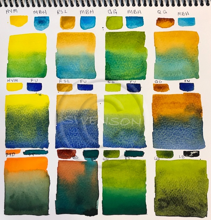
Mixing paint on the paper (not on the palette) will give you the most interesting greens. Why? You’ll have more variations. I’m sharing greens I made using the current colors on my palette. All of the colors listed below are Daniel Smith Watercolors with the exception of Burnt Sienna which is Winsor Newton. I’ve label all the paint swatches with abbreviations. If you're not familiar with color index code, don't worry. The first letter P means pigment, the next letter is pigment color family (R=red, B=blue…and so on) and the final number is the number issued by the ASTM (American Society for Testing Materials).
Mixing paint on dry paper


Abbreviation (HYM), Paint Name (Hansa Yellow Medium), Color Index Code (PY97)

HYM=Hansa Yellow Medium, PY97
RSL=Raw Sienna Light, PY42
PYD=Permanent Yellow Deep, PY110
GG=Green Gold, PY 150, PY 3, PG 36
QG=Quinacridone Gold, PO 48 PY, 150
MBH=Manganese Blue Hue PB15
FU=French Ultramarine, PB29
PT=Phthalo Turquoise, PB15:3, PG36
BS=Burnt Sienna, PR101
LB=Lunar Black, PBk11

Last week images were taken from my blog without 
permission.  Watermarks © have become an 
unpleasant necessity.


How many green combinations can you identify in my sketch? Some greens are very yellow and other are more blue, grayed... 

Hint: If a green area goes dull add a touch of Quinacridone Rose or Magenta when the pigment is still damp to liven it up.
Happy Painting!
Brenda


Wednesday, July 5, 2017

Modified Watercolor Palette

I’ve always liked to take things apart (disassemble). When I was a kid... if I really liked something I took it apart. Why? I wanted to know how it was made. And yes I always put things back together. I have continued my fascination with how things are made into adulthood. But now I usually take things apart to see how I can make it better.

I’ve modified most of my art supplies: Sketch-Bag, sketchbooks, brush holders, pen holder, a few easels…and lots of palettes.

I get lots of questions about my sketching palette because it looks
different. I modified it, too. The palette goes by many names but the same thing: Heritage, Alvin, Mijello. It’s a great palette but lacks an area to make contained puddles for washes.

Supplies: 
Palette: 18 well folding
Trays:  3 inch Triangle Bead Trays, plastic (easily found on internet search)
Glue: Gorilla Glue or Epoxy 
Sandpaper: Fine Tooth/Grit


Instructions:
Clean the inside of the palette surface and allow to dry.
Use a fine grit sand paper on the bottom of the trays for better adhesion. 
Use a small amount of glue on the trays and put into place. 
Leave palette open over night to dry.


Step-by-Step VideoModified Watercolor Palette. If video doesn't play click this link: Video

And what would a palette be without paint? Here's my Dot Card of paint choices. I use Daniel Smith Watercolors. In my sketch palette you'll notice I've added Green Gold and eliminated Phthalo Blue (GS). These colors are on my studio palette which has more wells. Wish I could send everyone a Dot Card but I only have enough to cover workshops...sorry. 


Daniel Smith Watercolors 

Green Gold (not seen on card)
Hansa Yellow Medium
Raw Sienna Light
Quinacridone Gold
Permanent Yellow Deep
Anthraquinoid Scarlet
Permanent Alizarin Crimson
Quinacridone Rose
Imperial Purple
French Ultramarine
Phthalo Blue GS
Cobalt Blue
Manganese Blue Hue
Cobalt Teal Blue
Phthalo Turquoise
Green Gold
Phthalo Green (BS)
Quinicradone Burnt Orange
Transparent Red Oxide (or Burnt Sienna, Winsor & Newton)
Lunar Black
Lavendar (not seen on card)
Buff Titanium (not seen on card)


Saturday, March 17, 2012

Negative Painting with Watercolor


 Negative painting is one of the most exciting approaches to watercolor I know! The technique is a unique approach of painting around an object to define it in a composition. When working in watercolor we have the challenge that other mediums do not. It is what we don’t paint that becomes the most important element. Think of yourself as a stone carver, chipping away, until only the most precious lights remains.  There are many techniques to saving the “lights” of the paper. I have experimented with masking fluids, tapes to save the “lights” but found the end result was either harsh or cutout looking. I preserve the “lights” of the paper from the very beginning by painting around them.
Opaque and Transparent


Opaque Paints (top row): Cadmium Yellow, Cadmium Red Light, and Horizon Blue.

Transparent paints (bottom row): Quinophthalone Yellow, Scarlet Lake, and Cerulean Blue.


It is best to avoid opaque paints (such as cadmiums) for negative painting. Opaque are fine for accent marks at the end but not for glazing. The technique requires numerous glazes which will become muddy with opaque paints. To determine if your paints are opaque or transparent do a simple test. With a permanent marker draw a bold line across a piece of watercolor paper. With paint the consistency of cream paints over the line. If the line is obscured at all it is opaque.

Learn more about paint characteristics by reading my post on the topic.
3 Colors for under-painting

 Underpainting: To determine which 3 colors I will use for the under-painting I make numerous color swatches. The swatches will contain a red, blue, and yellow. The colors do not need to be true primaries. When I mix the colors it is important to have the paint be the same consistence to encourage good mixing on the paper. I am looking for colors that have the underlying feeling of the subject matter. The 3 colors I selected are Carmine (C), Cobalt Teal Blue (CTB), and Raw Sienna (RS).

Step #1, Line Drawing: When I draw for a negative painting I am especially mindful of the space and shapes between the leaves and pomegranate (negative space). I want to have shape and size variety. I draw enough to get the general shapes. It is important not to over draw. Allow opportunities for additional shapes to be developed in the painting process.


Step #2: I wet the entire paper with clean water and introduce the 3 paint colors separately (Raw Sienna, Cobalt Teal Blue, and Carmine). I paint at an angle to encourage mixing as the paint runs down the paper. I don’t over work the surface with a paint brush but encourage the paint to mix on the paper. While the paper was still damp I lifted a little color off one pomegranate with a damp brush. Let thoroughly dry.


Step #3: Start glazing. I will add additional paint colors but I will use the 3 original colors through out the painting process. I consider these my “mother colors”. I paint hard edges against the pomegranate and some of the leaves, and soften edges with water as I move out from the subject. This is what I call the “adolescence of a painting”, because it looks and feels awkward. Let thoroughly dry.


Step #4: With each glaze I create new negative shapes and darker values. I sometimes soften edges with a light spray of water while the paint is wet. This technique is most evident on the bottom pomegranate where I used a brush saturated with Carmine to paint the lower section and quickly used a spray bottle to help move the paint down the paper. Let thoroughly dry.


Step #5: In the final stage I paint the darkest darks and smallest shapes. I use a rich deep green made with Marine Blue and Burnt sienna. While paint is still wet I drop a small amount of Scarlet Lake to the green mixture to liven it up. I am selective to place my darkest darks near my lights to intensify the focal area. I finish with cast shadows and a few details. 

Happy Painting!
Brenda


Step #5 Final step