Copyright Notice

© Copyright 2023 Brenda Swenson retains copyrights to all images (artwork and reference photographs). All images on this site are property of Brenda Swenson and may not be used in any way for commercial, financial or personal use without written consent. Brenda Swenson retains all rights to republication (printed and digital) and anything but personal viewing of artworks. www.SWENSONsART.net
Showing posts with label Demonstration. Show all posts

Sunday, January 10, 2021

Pull the Plug or Continue

These are dark and troubling times for the human heart…we are a hurting nation and world. 

Before the horrid events of Wednesday I was formulating what was going to be my last blog post. Why? With the creation of Zoom, Facebook Live and other platforms people now have other ways to learn and be inspired. I wasn’t sure if you needed what I was sharing anymore and thought my blog had run its course. Since most people receive my posts via email I’m not getting the same kind of feedback on my blog in comments section. When an anonymous person (troll) wrote a personal attack in the comments. I thought, that's enough. 

Wednesday morning I was painting on location when the alert came over my phone… attack on the Capitol. I absolutely lost it. I started crying and I couldn’t stop. After an hour I still couldn’t regain my composure. I couldn’t paint so I packed up and went home. Everything built up inside came flowing out in tears that wouldn’t stop. After a day I ended up posting something on Facebook in an attempt to find hope. I said, “Hope deferred makes a heart sick…I don't have any answers I just know 2020 was a disaster and 2021 is off to a lousy start. Looking for hope in a sick world and society”.  I’m not alone in how I feel nor am I comfortable showing my vulnerable side to the world (trolls attack the weak underbelly). The pandemic has amplified the feeling of being alone. I struggled to reach out to say I hurt and need help to see a brighter day will come. More than ever we need each other. On that dark day Facebook became my lifeline with words of comfort, encouragement and a pep talk. We each have a gift. Some are: comforters, cheerleaders, listeners, prayer partner, a bakers, a writers…? We can’t be all things to all people but we can be something. 

So many people came through for me on that day and I’m extremely grateful. I’d like to highlight one comment in particular (though all touched my heart). 
Here’s what he wrote: 
“Never, ever let this happen. To allow the acts of some to influence your ability to want to make art. Art is the beauty of the world and it (the beauty) still exists. You suck it up cupcake and get back to work and post more. I did both yesterday and today. There are people out here in this electronic land that we are conversing on right now that depend on you and I to help them deal with stupidity. You have been given a gift by the good Lord. Use it for what it was intended. I love ya buddy. Go to work, now”. ~Tom 

I took Tom’s advice and got back to work. I finished the painting began that dreadful Wednesday morning…
I’ve also come to the understanding that my lessons (art and life lessons) on my blog does matter. I can’t be all things to all people but I can do this. 

Be well and creative, 
Brenda

Wednesday, February 27, 2019

Framing Art Without Glass

Lately I’ve been looking into framing options. I don’t always want to use a mat, glass/acrylic. I am entering more shows that have oils and acrylics. These show do not have the same standards as watercolor societies and do not require a mat or glass/acrylic.

A word of WARNING…Most watercolor societies DO NOT allow a painting with any kind of varnish in a show. If you decide to explore these options you may not be able to enter the painting in a desired show…do your homework first!


CLAYBORD
After reading an article in Watercolor Artists Magazine I realized Claybord might have more possibilities that I thought. The product is made by Ampersand and has been around for a while. Claybord comes in a couple different surfaces.

Let me show you what I learned. I did two small pieces to explore the surface. I used the 5 x 7 Claybord, Textured. I used my inexpensive brushes since the surface felt rougher then watercolor paper. And the surface isn’t absorbent so I didn’t need a brush that held a lot of water.


The rooftop scene in Santa Barbara was done by wetting the Claybord first and letting the paint float on the surface in the same fashion as wet into wet. The surface does not absorb like watercolor paper and it takes longer for the surface to completely dry. It has interesting qualities that I like. 

 With the Persimmons I left a lot of the Claybord untouched and let the white of the Claybord exposed. I like how the paint moved on the surface and the colors remained bright. The surface has very little absorbency so the paint remains on the surface. It was easy to glaze on and get the results I wanted. I specially like how easy it was to lift paint and reclaim whites.


KRYLON UV - RESISTANT VARNISH (Matte or Glossy)
It’s important to seal the surface so the image has a barrier from the elements (dirt, smoke…) and light. I used KRYLON UV-Resistant, Acrylic Coating. I applied 3 or 4 coats. Let thoroughly dry between coats.
 In the video below you can see a side by side comparison of the matte and glossy finish.


You can stop here or go one step further.  My painting “Kettles & Cups” (below) has the addition of Dorland’s Wax. Read below…

DORLAND’S WAX
When I want a special finish I use Dorland’s Wax. It is non-yellowing and adds a soft glow to the surface.


Step #1 Seal surface of painting with a couple light coats of UV-Resistant acrylic varnish
Step #2 Scoop out a small amount of wax with a lint free cloth and apply it in a circular motion.  As soon as your cloth "drags", scoop out more wax.
Step #3  Allow coat to dry 24 hours.
Step #4  Using a clean, dry and lint free cloth, buff the surface.  You'll see a very slight sheen.
Step #5 Apply a second coat, let dry 24 hours and buff to a slight sheen.


Kettles & Cups

There's a lot of information available on the internet when it comes to researching products. I won’t pretend to know it all but I can share what I’ve learned along the way.


***
Have you seen the April issue of Watercolor Artist Magazine? I have an article called "All Toned Up". You'll see my demonstration that became the painting above, "Kettles & Cups". Hope you check out the issue and read my complete article.
The painting was selected to be in the California Art Club, Gold Medal Exhibition. Opening reception this weekend. I've been busy!


Happy Painting!

Brenda

Wednesday, November 29, 2017

Negative Painting - Poinsettias


Reference Photo 
Cameras are a wonderful tool but it's important to remember photographs are simply a springboard. I don’t rely too heavily on them. The sooner I respond to what’s happening on the paper and quit looking at the photo the better off I’ll be…especially with the technique of negative painting.

1: DRAWING 
I start by drawing the poinsettias with a 2B pencil on Arches 140lb cold press paper. I'm especially aware of the space and shapes between the flowers and leaves (negative space). I want shape and size variety. I draw enough to get the general shapes, but not too much. I intentionally leave areas understated so I'll have opportunities for negative shapes to develop in the painting process. 


MOTHER COLORS
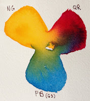
I use transparent paint to build up glazes. I limit my underpainting to 3 

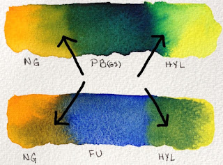
colors. To determine which 3 colors I will use I make numerous color swatches. The paints need to be the same consistency (whole milk) to encourage ample mixing on the paper. I'm looking for interesting combinations (how they mix when wet, range of colors, range of values and do they relate to my subject). The 3 paint colors I selected I call my Mother Colors: New Gamboge (NG), Quinacridone Rose (QR), and Phthalo Blue GS (PB GS).


2: UNDERPAINTING
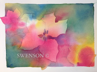
I wet the watercolor paper with clean water and introduce the 3 paint colors separately into the wet surface. I paint at an angle to encourage mixing as the paint moves. I don’t overwork the surface with a paint brush but encourage the paint to mix and mingle on the paper. I leave a third of the paper untouched with paint. As it dries the paint will continue to move and hopefully a small amount of light/whites will remain. Let throughly dry naturally (without a hair dryer).

3: START GLAZING
I continue with my Mother Colors (original 3 colors) and I pull French 

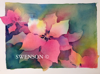
Ultramarine into the mixing area of my palette. When I bring a new color into the mix it touches one of the original Mother Colors. Why? Having a new color touch one of the original 3 colors creates harmony in the glazing process. When I begin glazing I'll paint over some of the poinsettia petals, leaves and background at the same time. I start in the upper left hand corner and work clockwise. I paint hard edges against the petals I want to save and soften as I pull away. As I work clockwise around the main poinsettia I vary my colors slightly with the Mother Colors and French Ultramarine. Let throughly dry.


4: GLAZING CONTINUED - GREENS
Periodically I wipe off my palette especially if the mixing area has become a neutralized mixture. Mud, neutrals or grays are wonderful and every painter should know how to mix them. But know when you want them and how these grays work to make other colors more lively.

I pull out fresh paint into the center of my palette. I have the Mother Colors (NG, QR, PB), French Ultramarine and the new addition of Hansa Yellow Light. Starting on the left side directly below the poinsettia and working counter clockwise. I use a mixture of French Ultramarine & 

Quinacridone Rose. I carve out shapes with hard edges against the petals. As I move across the lower section I want my colors to move from purples into the greens. With each brush load I slightly shift the green. Below the center poinsettia is a cooler green and pushes towards the blues. As I move across the lower section (left to right) I carve out more petal shapes. Above the far right poinsettia the greens are much warmer and have more Hansa Yellow Light. The small negative shapes in the center of each flower is a dark mixture of French Ultramarine & Quinacridone Rose. Let throughly dry.


FINAL STAGE: DARKEST DARKS, SMALLEST SHAPES & DETAILS
As the poinsettia turns from the light I have a variety of shadows. Form shadows have soft edges and cast shadows have hard edges. The shadows on the petals are a darker value of Quinacridone Rose with a touch of French Ultramarine as it turns from the light. When I need to soften the edge of a form shadow I use clean water on the edge before the paint has a chance to dry. The leaves beneath the center poinsettia is the darkest passage of negative painting. I use a mixture of Phthalo Blue GS & New Gamboge, before the paint has a chance to loose its shine I drop a little Quinacridone Rose into the passage. The unexpected warmth brings life to the dark greens. A few touches of color in the center of the poinsettia and it’s finished.


CONCLUSION
Hope you’ve enjoyed this short demonstration. I used the Daniel Smith Essentials SetThe set consists of six tubes of paints. A warm and cool: red, blue and yellow. The colors are VERY transparent (exception of Hansa Yellow Light which is semi-transparent). 

Happy Painting!
Brenda

Monday, October 23, 2017

Walnut Ink & Watercolor

Autumn brings with it a beautiful array of colors and textures. At our Farmer’s Market a
new crop of persimmons are available in a variety of shapes and colors.  I came home with a bag full and put them in a favorite dish. I loved how the contrast of colors and textures played off of each other: orange-red against blue-green. Smooth against rough.

When Daniel Smith Artists’ Materials asked if I’d like to try their Walnut Ink. I was eager to give it a try. I am particularly fond of inks with warm tones. The idea of drawing the persimmons with walnut ink was appealing. Before the bottle arrived I did a little research on their website. I thought walnut ink would fade. I was wrong. Here is what I found.

“DANIEL SMITH Walnut Ink is lightfast, non-acidic, transparent, and low staining.  It’s finely pigmented, sepia-colored, water-based ink made from walnut husks. It's great for all types of drawing styles and calligraphy, and works beautifully with a dip pen or brush. With a brush, DANIEL SMITH Walnut Ink handles like a transparent watercolor with good layering, and lifting capabilities in darker washes. The rich color resembles traditional walnut-based inks, but will not fade.” 

Step 1
Watercolor Paper is Bockingford cold press 140lb. My favorite technique for drawing is continual line contour. I keep my pen on the paper for the majority of the drawing. I am using a bamboo reed pen…Why? I enjoy line variation.
Helpful hint: Before you begin drawing soak the tip of the bamboo reed pen in 3 inches of water for 20 minutes.  The pen will have an increased ability to hold ink.


Step 2
I start by pulling fresh color into the center of my palette. I work on a dry surface and mix the colors on the paper. You’ll noticed the Walnut Ink moves…I like that. If I touch the line gently it will move a little and more if I scrub the line with my brush the more it moves.  
The persimmons are a mixture of Hansa Yellow Medium, Anthraquonoid Scarlet & Quinacridone Burnt Orange. The Leaf and stems are Quinacridone Gold & French Ultramarine.


Step 3
The plate is painted with Cobalt Teal Blue. I intentionally disrupted the details on the plate with my brush. I want the lines to defuse. I don’t want the lines to be in sharp focus especially since the majority of the plate will be effected by shadows from the persimmons.


Step 4
Shadows are my favorite subject! The presence of light defines form and gives life to a subject. I begin my making two puddles of paint on my palette: 1. Quinacridone Burnt Orange & Quinacridone Rose 2. Imperial Purple. I start by painting the form shadows on the persimmons with Quinacridone Burnt Orange & Quinacridone Rose and quickly move into the cast shadows on the plate with Imperial Purple. I want a soft transition between the objects and the colors.


Step 5
The final stage I use Imperial Purple in the background. Before the passage has lost its shine I touch a small amount of Phthalo Turquoise into the area. Final touches are added to the foliage area.


My Daniel Smith dot card has a white X on the colors I used for this piece. All the materials used in this demonstration are listed below. 

Ink: Walnut Ink (new bottle same ink)
Watercolor Paper: Bockingford 140lb cold press


Happy Painting!
Brenda


Sunday, June 4, 2017

Continual Line Contour


I've been using "continual line contour" drawing for so long I've forgotten when I learned how. I can tell you it has changed the way I see, draw and paint. I've learned more about observing edges, measuring, overlapping and page placement than any other approach. 
   
In my workshops (sketching, illustrated journal or plein air workshop) I start by demonstrating and teaching this technique. At first students might feel hesitant. But by the end of the workshop I have won them over.  

I keep a collection of props on hand and I ask students to bring props to the workshop too. The more variety the better: jars, kettles, paint tubes, brushes, mugs, wooden and metal tools, artificial flowers, vegetables. 
During the workshop I use a timer so the drawings don't become too involved or precious.  It’s funny how the mind acts when you use a timer…absolute and complete focus! We start by drawing: 1 object in 3 minutes, 2 objects in 6 minutes, 3 objects in 10 minutes. All drawing is done from life (no photos). Once we get comfortable with drawing we begin painting.

Here's a workshop demo:

During the drawing keep your pen on the paper as long as possible. Yes, I said PEN! This exercise will teach you to slow down, look longer and be more certain of shapes, size and edges. There will be a certain amount of distortion to the drawing but I consider this part of the charm.  Continual Line Contour is a good exercise no matter how long you've been drawing. 

Here's a short video I made showing, "Continual Line Contour". I usually work from life but in the video I use a photo so my view would be the same as the viewers. If the video doesn't play click on the link: https://youtu.be/eIVjtb5yQ9Q


"Art like life, is knowing where to draw the line".  Happy Sketching!
Brenda


Monday, February 27, 2017

Don't Carpet Your Rut #2


Any form of repetition can be a rut: technique, subject matter, perspective, lighting or paint colors.  The quote, “Don’t carpet your rut”, reminds me not to get too comfortable doing the same thing. Painter’s can get in a rut because we want a successful outcome every time. Anything that’s repetitive is playing it safe. If you want to grow it means you have to take a risk. The risk can be large or small. 

If you find yourself in a creative rut…start climbing out! I begin by thinking, What if? How many ways can I sketch or paint a subject differently? The answer is countless.

The more effort and imagination I put into exploring a new approach the better the experience will be. The object can be quite simple.  The images don't need to be very big, 4x6 or 5x7 inches will do. I sketch the subject numerous times mixing drawing and painting techniques. This is a great way to explore new ideas by investing a small amount of time.

Pens: Bamboo Reed, Fountain, Disposable, Ballpoint…
Ink: waterproof , soluble, colored…
Drawing Tools: Pencil, Charcoal, Markers, Brush…
Papers: Watercolor (cold or hot press, rough) pastel paper, Japanese papers…
Paint Colors: Regular Palette, Triads, Tonal, Warm or Cool… 
Painting Techniques: wet-into-wet, flat or graduated washes, glazing…
The examples are numbered in order completed. Each drawing took less than 3 minutes and were painted in 10 minutes or less. For me it is important to keep the exercises quick and fun.


#1 Drawn with a bamboo reed pen dipped in liquid watercolors. Painted with regular palette of Daniel Smith Watercolors.

#2 Drawn with a fountain pen dipped in sepia waterproof ink. Value study with sepia pencil and painted with Lunar Black.

#3 Drawn with pencil. Painted with regular palette and Payne’s Blue Gray. The new Payne’s Blue Gray mixed beautifully to create rich glowing darks in the background.

#4 Drawn with a fountain pen with blue waterproof ink. Painted with the 8 new colors from Daniel Smith.  I love putting these new colors to work!

Now it’s your turn. Once you start, you’ll see endless possibilities. I’m sure you can add a few of your favorites to the list! See more examples here.

Happy Sketching! 
Brenda

Monday, May 9, 2016

Fear of Failure

It's easy to fall into a creative rut. It happens when you do the same thing over and over, and over, and over…  Any form of repetition (subject matter, technique, color…) can be the kiss of death to creativity. If you're worried about painting a “winner” every time you’ll quit If you quit stretching you’ll quit growing. Life is too short not to get a few stretch marks! 

If you want to grow it means you have to take a risk. The risk can be large or small but without the risk there is no challenge, without a challenge you become bored, and your work lacks excitement. Before too long you’ll lose interest in your own work because….YOU ARE BORED! If you find yourself in a rut, GET OUT! The fastest way to pull yourself out of a rut is shake things up! This week do something that  #!*!#+ scares you. Do it for you. Find out what you're capable of. Push the limits of your ability. Did you know adrenaline heightens your senses?

Does working through fear come easy for me…nope! I know more about fear than I’d like to admit. Unfortunately, I let fear rob me of my life for too many years…it paralyzed me! It robbed me of my potential personally and creatively. It’s okay to be afraid but don’t let the fear control you…DO IT ANYWAY! 

Try something this week that takes you out of your comfort zone. Here a few suggestions: 
Drawing Tools: pencil, bamboo pen, soluble ink, waterproof ink, markers
Brushes:  Flat, LARGE round
Technique: watercolor, collage, pen & ink
Surfaces: tinted paper, Japanese paper, slick paper, rough paper
Size: Do something BIG, miniature
Subject: landscape, nudes, old trucks, portraits, street scenes
View: from above (birds view), from below (worms view)
Atmosphere: sunny, foggy, rainy
Lighting: soft or sharp, warm or cool
Plein Air: Working outdoors


Recently I challenged myself. I wanted to see if I could do a pen and ink with watercolor on a larger scale, 22x30. I knew my ink lines had to be bigger. How was I going to do it? I started looking around and decided my largest Bamboo pens were perfect. I liked the width and slight irregularity of the lines would add to the sketchy feeling. No pre-drawing with pencil. It was wonderfully freeing to let the ink lines wiggle, blob and splatter ink. I wasn't out to create perfection I was having fun...and it wasn't so scary after all. 


used Noodler’s Ink, Polar Brown (waterproof), Bockingford watercolor paper 22x30, 140lbs cold press and Daniel Smith Watercolor.

 I wanted the finished piece to feel "sketchy". I resisted the temptation to refine things too much.  I wanted the look of a large sketch. Which brings up a good question...what exactly is a sketch? Is it the size? The approach? The materials used? I don't have a good answer. I love to play and push the boundaries of ink and watercolor and that's all that matters to me. I'll let others worry about definitions and I'll keep sketching and painting.

Happy Painting!
Brenda


Man of Volterra, Italy

Sunday, December 13, 2015

Poinsettia: Negative Painting Demonstration


Reference Photo 
Cameras are a wonderful tool but it's important to remember photographs are simply a springboard. I don’t rely too heavily on them. The sooner I respond to what’s happening on the paper and quit looking at the photo the better off I’ll be…especially with the technique of negative painting.

1: DRAWING 
I start by drawing the poinsettias with a 2B pencil on Arches 140lb cold press paper. I'm especially aware of the space and shapes between the flowers and leaves (negative space). I want shape and size variety. I draw enough to get the general shapes, but not too much. I intentionally leave areas understated so I'll have opportunities for negative shapes to develop in the painting process. 


MOTHER COLORS
I use transparent paint to build up glazes. I limit my underpainting to 3

colors. To determine which 3 colors I will use I make numerous color swatches. The paints need to be the same consistency (whole milk) to encourage ample mixing on the paper. I'm looking for interesting combinations (how they mix when wet, range of colors, range of values and do they relate to my subject). The 3 paint colors I selected I call my Mother Colors: New Gamboge (NG), Quinacridone Rose (QR), and Phthalo Blue GS (PB GS).

2: UNDERPAINTING
I wet the watercolor paper with clean water and introduce the 3 paint colors separately into the wet surface. I paint at an angle to encourage mixing as the paint moves. I don’t overwork the surface with a paint brush but encourage the paint to mix and mingle on the paper. I leave a third of the paper untouched with paint. As it dries the paint will continue to move and hopefully a small amount of light/whites will remain. Let throughly dry naturally (without a hair dryer).

3: START GLAZING
I continue with my Mother Colors (original 3 colors) and I pull French

Ultramarine into the mixing area of my palette. When I bring a new color into the mix it touches one of the original Mother Colors. Why? Having a new color touch one of the original 3 colors creates harmony in the glazing process. When I begin glazing I'll paint over some of the poinsettia petals, leaves and background at the same time. I start in the upper left hand corner and work clockwise. I paint hard edges against the petals I want to save and soften as I pull away. As I work clockwise around the main poinsettia I vary my colors slightly with the Mother Colors and French Ultramarine. Let throughly dry.


4: GLAZING CONTINUED - GREENS
Periodically I wipe off my palette especially if the mixing area has become a neutralized mixture. Mud, neutrals or grays are wonderful and every painter should know how to mix them. But know when you want them and how these grays work to make other colors more lively.

I pull out fresh paint into the center of my palette. I have the Mother Colors (NG, QR, PB), French Ultramarine and the new addition of Hansa Yellow Light. Starting on the left side directly below the poinsettia and working counter clockwise. I use a mixture of French Ultramarine &

Quinacridone Rose. I carve out shapes with hard edges against the petals. As I move across the lower section I want my colors to move from purples into the greens. With each brush load I slightly shift the green. Below the center poinsettia is a cooler green and pushes towards the blues. As I move across the lower section (left to right) I carve out more petal shapes. Above the far right poinsettia the greens are much warmer and have more Hansa Yellow Light. The small negative shapes in the center of each flower is a dark mixture of French Ultramarine & Quinacridone Rose. Let throughly dry.


FINAL STAGE: DARKEST DARKS, SMALLEST SHAPES & DETAILS
As the poinsettia turns from the light I have a variety of shadows. Form shadows have soft edges and cast shadows have hard edges. The shadows on the petals are a darker value of Quinacridone Rose with a touch of French Ultramarine as it turns from the light. When I need to soften the edge of a form shadow I use clean water on the edge before the paint has a chance to dry. The leaves beneath the center poinsettia is the darkest passage of negative painting. I use a mixture of Phthalo Blue GS & New Gamboge, before the paint has a chance to loose its shine I drop a little Quinacridone Rose into the passage. The unexpected warmth brings life to the dark greens. A few touches of color in the center of the poinsettia and it’s finished.


Hope you’ve enjoyed this short demonstration. I used the Daniel Smith Essentials SetThe set consists of six tubes of paints. A warm and cool: red, blue and yellow. The colors are VERY transparent (exception of Hansa Yellow Light which is semi-transparent).

Happy Painting!
Brenda