Copyright Notice

© Copyright 2026 Brenda Swenson retains copyrights to all images (artwork and reference photographs). All images on this site are property of Brenda Swenson and may not be used in any way for commercial, financial or personal use without written consent. Brenda Swenson retains all rights to republication (printed and digital) and anything but personal viewing of artworks. www.SWENSONsART.net
Showing posts with label Watercolor. Show all posts

Monday, October 23, 2017

Walnut Ink & Watercolor

Autumn brings with it a beautiful array of colors and textures. At our Farmer’s Market a
new crop of persimmons are available in a variety of shapes and colors.  I came home with a bag full and put them in a favorite dish. I loved how the contrast of colors and textures played off of each other: orange-red against blue-green. Smooth against rough.

When Daniel Smith Artists’ Materials asked if I’d like to try their Walnut Ink. I was eager to give it a try. I am particularly fond of inks with warm tones. The idea of drawing the persimmons with walnut ink was appealing. Before the bottle arrived I did a little research on their website. I thought walnut ink would fade. I was wrong. Here is what I found.

“DANIEL SMITH Walnut Ink is lightfast, non-acidic, transparent, and low staining.  It’s finely pigmented, sepia-colored, water-based ink made from walnut husks. It's great for all types of drawing styles and calligraphy, and works beautifully with a dip pen or brush. With a brush, DANIEL SMITH Walnut Ink handles like a transparent watercolor with good layering, and lifting capabilities in darker washes. The rich color resembles traditional walnut-based inks, but will not fade.” 

Step 1
Watercolor Paper is Bockingford cold press 140lb. My favorite technique for drawing is continual line contour. I keep my pen on the paper for the majority of the drawing. I am using a bamboo reed pen…Why? I enjoy line variation.
Helpful hint: Before you begin drawing soak the tip of the bamboo reed pen in 3 inches of water for 20 minutes.  The pen will have an increased ability to hold ink.


Step 2
I start by pulling fresh color into the center of my palette. I work on a dry surface and mix the colors on the paper. You’ll noticed the Walnut Ink moves…I like that. If I touch the line gently it will move a little and more if I scrub the line with my brush the more it moves.  
The persimmons are a mixture of Hansa Yellow Medium, Anthraquonoid Scarlet & Quinacridone Burnt Orange. The Leaf and stems are Quinacridone Gold & French Ultramarine.


Step 3
The plate is painted with Cobalt Teal Blue. I intentionally disrupted the details on the plate with my brush. I want the lines to defuse. I don’t want the lines to be in sharp focus especially since the majority of the plate will be effected by shadows from the persimmons.


Step 4
Shadows are my favorite subject! The presence of light defines form and gives life to a subject. I begin my making two puddles of paint on my palette: 1. Quinacridone Burnt Orange & Quinacridone Rose 2. Imperial Purple. I start by painting the form shadows on the persimmons with Quinacridone Burnt Orange & Quinacridone Rose and quickly move into the cast shadows on the plate with Imperial Purple. I want a soft transition between the objects and the colors.


Step 5
The final stage I use Imperial Purple in the background. Before the passage has lost its shine I touch a small amount of Phthalo Turquoise into the area. Final touches are added to the foliage area.


My Daniel Smith dot card has a white X on the colors I used for this piece. All the materials used in this demonstration are listed below. 

Ink: Walnut Ink (new bottle same ink)
Watercolor Paper: Bockingford 140lb cold press


Happy Painting!
Brenda


Thursday, May 7, 2015

Hollyhocks Painting Demonstration

Recently I've had the opportunity to work on a couple projects with Daniel Smith Artists' Materials. Their paints have been a mainstay in my palette for years. 


For this demonstration of the "Hollyhock" I worked with a set called the "Essentials". The new set has six 5ml transparent watercolors. The pigments were carefully selected to give you a wide range of colors and values. When mixed together the colors you can create are endless! 

Hansa Yellow Light,  New Gamboge, Quinacridone Rose,  Pyrrol Scarlet, Phthalo Blue GS and French Ultramarine


Hollyhocks, By Brenda Swenson

Step 1: Drawing
I start by drawing with a 2B pencil on Arches 140lb cold press paper. I am especially aware of the space and shapes between the flowers, stem and leaves (negative space). I want shape and size variety. I draw enough to get the general shapes, but don't over draw. I want to leave opportunities for shapes to develop in the painting process. 


Step 2: Selecting Colors 
I use transparent paint to build up glazes. To determine which 3 colors I will use for the underpainting I make numerous color swatches. The paint needs to be the same consistency to encourage good mixing on the paper. I'm looking for interesting combinations (how they mix when wet, range of colors, range of values and do they relate to my subject). The 3 paint colors I selected are Daniel Smith: Hansa Yellow Light (HYM), Quinacridone Rose (QR), and Phthalo Blue GS.


Step 3: Underpainting
I wet the entire paper with clean water and introduce the 3 paint colors separately onto the wet surface. I paint at an angle to encourage mixing as the paint moves. I don’t over work the surface with a paint brush but encourage the paint to mix on the paper. Let completely dry.


Step 4: Start Glazing
I continue with my Mother Colors (original 3 colors) but I also pull out French Ultramarine and New Gamboge. When I bring a new color to the mix it always touches one of the Mother Colors. I start at the top working my way down the paper with a mixture of French Ultramarine and New Gamboge. Painting hard edges against the flowers to carve out the big shapes. As I move down the page I push the colors towards green with Phthalo Blue GS. Let completely dry.


Step 5: Shadows
I begin to define the flowers with a mixture of Quinacridone Rose and Pyrrol Scarlet. The surface is completely dry. As the form turns towards the light I have a variety of edges. Form shadows have soft edges and cast shadows have hard edges. I soften the form shadow edges with clean water. Let completely dry.


Step 6: Negative Painting and Final Details 
In the final stage I paint the darkest darks, smallest shapes and add final details. I focus on carving around the shapes (negative painting) to suggest the stem and leaves. On my palette I make two puddles of Phthalo Blue GS and Hansa Yellow Light. I allow these two puddles to mingle slightly. I don't let the colors over mix. Each brush load will have a slight shift in color. I also drop a little Quinacridone Rose into the darkest area of green below the largest flower. The unexpected warmth livens up the area.

I finish by adding final details. I start with the center of the largest flower using Phthalo Blue GS and while still wet I add a touch of New Gamboge. Next I paint the darkest shadows on the flower petals. I make a reddish purple mixture with French Ultramarine and Quinacridone Rose. The greatest saturation of color will be in the darkest shadows.

Hope you’ve enjoyed this short demonstration. If you were unfamiliar with these paint colors hopefully I’ve opened your eyes to their wonderful transparency, richness and mixing ability!
You can see them here: The Essentials

Happy Painting!
Brenda
NWWS, SDWS, WW
www.SwensonsArt.net

© Copyright 2019, Brenda Swenson retains copyrights to all artwork. All images on this site are property of Brenda Swenson and may not be used in any way for commercial, financial or personal without prior written consent. All Rights Reserved for republication (printed, digital or painted) and anything but personal viewing of artworks on this site. 

Sunday, April 20, 2014

Wish I Had Your Talent

Filled sketchbooks on top shelves
In the last 22 years I have filled dozens upon dozens of sketchbooks. At last count I've filled 60 plus books. I've worked hard at perfecting my craft. My sketchbooks mean more to me than any painting I’ve ever done. I am not afraid to try new mediums, techniques, subjects and I can see tangible growth in my work. Within the covers of these books I can see my life. Here is where I am free to express myself with words and images. The pages contain the ups and downs of my life. I treasure these books.

Lighthouse Sketch 1992
Next week Danny Gregory and a film crew will be at my house to film my klass for Sketchbook Skool (the spelling isn't a typo). Danny thought it would be helpful to have students see some of my earliest sketchbooks. I had to go deep into the closet to pull out one of my first watercolor sketchbooks but I found one from 22 years ago. YIKES...this is a humbling experience! What a powerful reminder of how far I've come. I can honestly say to anyone who says "wish I had you talent or gift" ... I wasn't very talented or gifted 22 years ago.  It is also very clear how much I improved when I found a teacher who nurtured and encouraged me. Their teaching influence is very notable. I didn't make this journey alone...I was guided and nurtured along the way by teachers I admired and trusted. During their years of instruction I can see my greatest growth. I owe them a debt of gratitude! 
Lighthouse Sketch 2013

The first page of a new sketchbook feels a little unnerving and the last page feels a little sad...like the end of a friendship. With each new sketchbook I wonder where it will lead me, and what lessons I will learn along the way. 

I can hardly wait to share my sketchbooks, experience and knowledge. 

Happy Sketching!
Brenda
  

Sunday, September 1, 2013

When I Hurt...


This morning I caught my breath...it has been a year since Daniel and I made our trip to Trinidad,  CA to be with Thomas & Lisa (my oldest son and girlfriend).  The long weekend was perfect in every way... even Daniel catching poison oak was a blessing because it got him into the doctors office. While at the appointment Daniel asked the doctor about a lump he felt on the side of his neck.  Most of you know the rest of the story...(you can read it here)
A year has passed and Daniel is doing wonderful for which I am very grateful. Nowadays I'm surprised that whenever I talk about it I begin to cry. During the year of turmoil I held my emotions in check (most days).  I wouldn't dare give thought to the idea he wouldn't beat cancer!

Why am I telling you this? Usually I share sketchbook pages that reflect joy, travel,  adventure, and all around happy experiences. Rarely do I share pages of when I'm at my lowest.  For some reason I feel compelled to share my experience of how I process emotions in my sketch journals. Does somebody need to read this today or is it part of my healing process to let it go? I don't know the answer to that question.  I simply feel I am called to do so.

On my page, I AM SO TIRED OF BAD NEWS! I write that along with Daniel my dad's cancer has returned. It's been nine months since I wrote this page. Today he is being treated at the City of Hope and he's not doing very good. My heart aches to see him so sick. I save all his phone messages, little notes... I want to treasure each and every minute with him. Please keep him in prayer. He's name is Wes.

On the page OUCH! I was raw with emotion and wrote some pretty strong words... I needed to get out. When I write something like this I'm conscious that these books will be around after I'm gone.  I don't want my words to hurt somebody I love that is why I'll use a water soluble pen. When I am ready I use a wet brush and smear the words.


We all need a safe place to express ourselves without fear or concern of what others may think. I hope
♥♥♥Me and my Dad ♥♥♥
through sharing these pages I've opened your mind to ways of healing through art and words.

Happy Sketching!
Brenda

Tuesday, March 19, 2013

Putting Zeta Paper to the Test


Recently the Stillman & Birn Sketchbook Company sent me samples of their new Zeta Series paper. When the paper arrived the first thing I noticed was the papers surface. It is similar to Hot Press watercolor paper. To the touch the surface is smooth, bright white and the weight is 180 lb. The Zeta Series has both internal and surface sizing, it is acid-free, lignin-free and chloride-free.  

Click on image to see larger
Step #1 Pen drawing. I used the technique of Contour Drawing with a waterproof pen.

Step #2 Watercolor painting. I began by blocking in the larger areas with watercolor.

Step #3 Here is where the paper is put to the test. I like to build up rich color in glazes. The paper held up great
.Where I wanted to lift color for highlights the color came up easily with a soft brush and clean water.

Pen & Ink
I thoroughly enjoyed how pens move on the surface…they glide! I also noticed that some inks take a little longer to dry than others. This has to do with the papers sizing. This isn't
a problem, just an important fact. Quite often I select pens/ink because they move when wet, but for this demonstration I wanted the line work to stay put. The Pitt Pens by Faber-Castell dried instantly, and this is the pen I used (medium tip). Noodler’s Ink in Polar Brown and Lexington Gray dried instantly, too.

Watercolor
I am predominately a watercolor artist so I was curious to see how the paper would hold up with watercolor. The paper was a joy to paint on! It was easy to build up layers, soften edges, and lift color. I found it easier to work on than Hot Press watercolor paper. All my colors remained clear and vibrant and the paper didn't warp.

Final Thoughts
I take all my artwork seriously whether I'm sketching or painting. The Stillman & Birn Company takes their paper seriously, too. I can’t wait for the new sketchbooks made with Zeta paper to arrive in stores. I will definitely be using it!

Happy Sketching! 

Brenda

Thursday, March 7, 2013

How to Set-Up a Watercolor Palette

It is time to share these helpful tips again. Very little information is available on how to set up a watercolor palette... so I figured I'd share my technique.The palette I am showing is a Heritage Folding Palette with 18 wells. It is one of the nicest travel palettes I have seen in a while and a great price. The lid has a soft plastic seal, which keeps the palette from leaking and keeps your colors from drying out quickly. It comes with a removable clear plastic tray. I don't use the tray since the palette has an ample mixing area. 

(1) Before I use a palette I give it a light scrubbing with a mild abrasive such as soft scrub. This takes the slick surface off the mixing area and removes any residues from the manufacturing. Be sure to thoroughly rinse off the palette…you don’t want this in your paint.(2) I fill the 18 wells with my favorite selection of paint. Don’t put tiny dabs of paint in the wells…fill the wells! Tiny dabs of paint will eventually just fall out. Hold the tube over the deep end of the well then come back towards the shallow end while squeezing the tube.

(3) Let the palette sit open for a day or two. When the paint had set up and is no longer sticky I wet my thumb and push down in the center of each well. What this does is create an indentation for the water. When I get ready to paint I lightly mist the paint wells and I am ready to go.
Here you can see how nicely the paint mixes and mingles because the palette was prepared with a mild abrasive.

I've received questions about traveling with paint on an airplane.  I put my palette in my carry on luggage.I don't bring paint in tubes but instead fill my palette with fresh paint a few days before and let air dry so the paint becomes more solid. When I arrive at my destination I mist the paint with fresh water, put a small sponge inside and close overnight. The next day the paint are fresh and juicy again.  I haven't had a problem with security, yet.

My selection of paint colors by Daniel Smith Fine Watercolors


Happy Painting!


Brenda

Tuesday, February 12, 2013

An Illustrated Journey

 I’ve shared my travel journals with you (my readers) for years. You’ve become familiar with my uncontainable love of watercolor and my delight in sketching on location. I sketch anything that catches my eye… street scenes, people, open markets, cathedrals, lunch at a cafe… Each night before I go to sleep I reflect upon the day and write within the pages of my sketchbook. My adventures may be a short weekend up the coast or weeks away to a distant land. I may be with family or teaching a workshop to people I’ve met for the first time. I travel to see, experience, and explore my world…one sketch at a time. I am a sketch hunter! I have several shelves filled with these sketchbooks. They bring me a great source of joy.  Not only do I enjoy the experience of creating these books…I enjoy sharing them!

I don’t know if you are familiar with Danny Gregory’s books (Everyday Matters, An Illustrated Life, A Kiss Before You Go…).  I have followed his work for years and I admire his work greatly. A little over a year ago he asked me to be a contributor to his book “An Illustrated Journey”. Of course, I said YES!   
An Illustrated Journey captures the world through the eyes of talented artists, illustrators and designers. You'll experience the wonder of seeing familiar sights through a fresh lens but, more important, you'll be inspired to set pen to paper and capture your own vistas. The book features 40 artists and has 272 pages of sheer inspiration! Last week the book arrived at the warehouse and they have begun shipping to stores. The book will be in stores soon but you can preview and purchase on Amazon, now.
Danny thought it would be fun to introduce people to the artists in the book on a more personal level. To enhance the experience of reading the book, he has been recording video chats with the contributors and will be sharing them on YouTube and a special channel on Vimeo.  Each one is 20-60 minutes and he’ll be posting them twice a week.  Last week I did a video chat with Danny. It was great fun! I’ll let you know when my video chat is posted. You can also check Danny’s site to learn more.

Happy Sketching!
Brenda

Tuesday, January 1, 2013

Sketching the Rose Parade Floats


Me and my sketching buddy, Judy

I have been sketching the Rose Parade Floats, in Pasadena for 10 years. Each year I go through the process of getting permission to be on the float building floor with hundreds of people who are working on the floats. Most of the floats are built inside two large warehouses that are called float barns. Inside these buildings can be super cold!! This year I had on three layers of clothes and gloves. The float barns are a short distance from Colorado Blvd where the Rose Parade begins. Sketching can be a real challenge. It’s tricky just to see the floats through all the scaffolding and people while staying out of the way. If were in the way they’d ask us to leave. People were gluing flowers, seeds, and spices, cutting stems off straw flowers, sticking vial with water into the float frame to hold roses, moving scaffolding. People look like little specks climbing all over the floats. The P.A system was constantly calling a “Float Chief” to an area. The energy in the building is magical! The floats I sketched this year were, The Lyon's Club International. I loved sketching all of the architectural landmarks, most of these buildings I've seen.  The second float was the Nurse's Float. The title "A Healing Place", stole my heart. As many of you know my son Daniel was diagnosed with cancer in September. Thank you for all your kind words and prayers...keep it coming! We could use some healing in 2013!
Here you can see the birds I sketched, top center of photo.
  Notice I don’t glue on flowers. I’m like a cat and I don’t like my “paws” sticky. 

Happy New Year and Happy Sketching!

Brenda


Wednesday, November 7, 2012

Pomegranate Collage Demonstration


I love the feeling of being in the middle of a painting and things are spread out all around my studio...I am in my element! The business of being creative gets messy sometimes. I like creative chaos. I just finished a stained paper collage. I thought it would be fun to share the collage process in its stages.

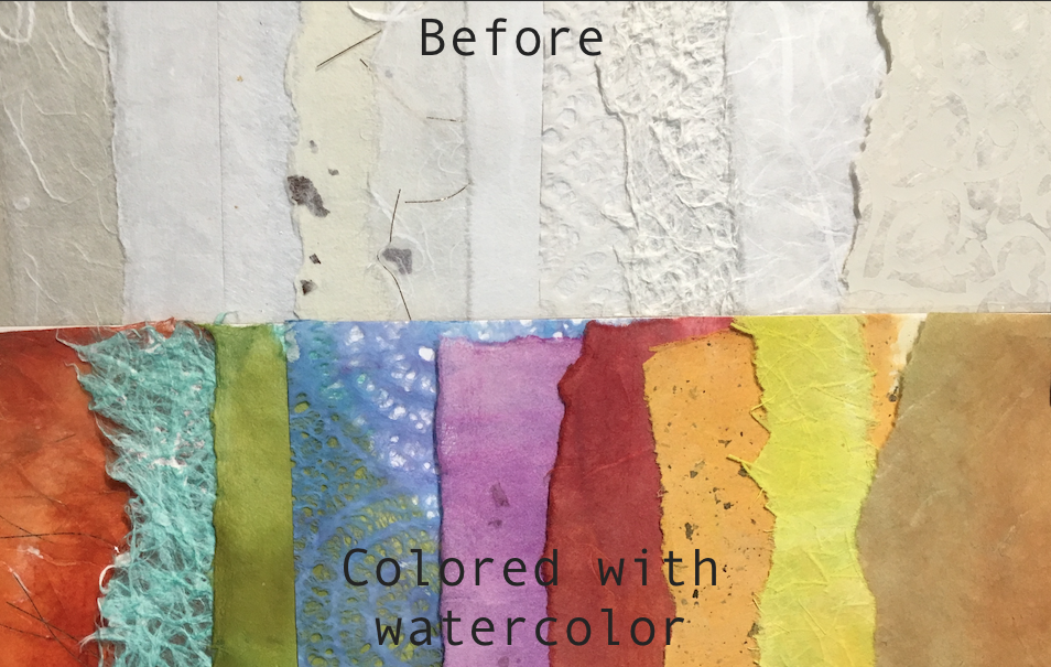
I stain/paint a lot of papers with watercolor. This takes time so I usually set aside a day to do this. I stain the paper with primary, secondary colors and neutrals. I line the floor with paper towels. I lay the painted papers on the floor to dry. 

The Japanese papers are commonly known as Mulberry, Unryu, Washi Paper. Do I have a favorite paper...no. Do I have resource... no. I just buy papers when I find something that interests me. Some papers are transparent and others opaque.  I suggest you do a word search for the papers I listed above and see where you can purchase some.

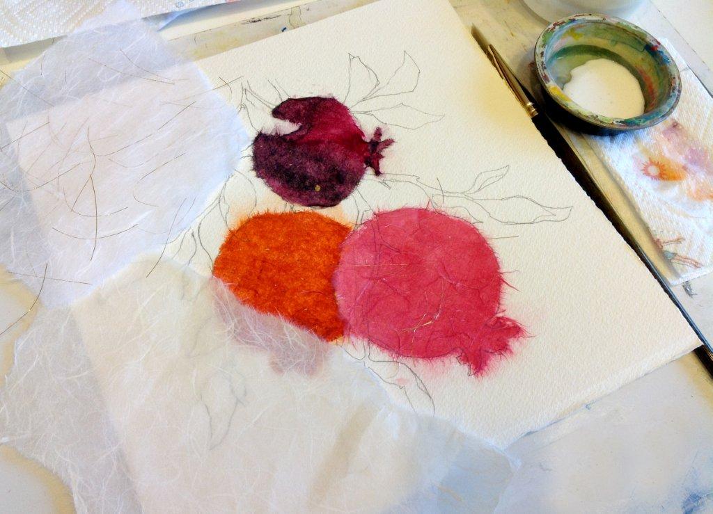
I draw the image on a 300lb piece of watercolor paper. I begin by blocking in the image with the stained papers. I use acrylic matte medium to adhere the papers to the watercolor paper. In the beginning the images looks rough but it is only the early stage
I have covered about half the watercolor paper with pieces of stained papers. I block in the large shapes first and tear the stained papers to get desired shapes. When I come up against small shape I’ll lay the Japanese paper on top of my drawing and use a wet brush to draw an outline. The paper will tear in a more controlled manner along the wet line. The collage paper should overlap the edges of other papers. The entire surface of the watercolor paper needs to be covered with collage.

Before I begin painting I need to unify the surface of the collage. I use a 50/50 mixture of matte medium and water. I painted the mixture over the entire collage and allowed to air dry before I begin painting.

The technique of painting on a surface that is covered with acrylic matte medium is very different than a traditional watercolor. The surface does not have the same absorbency as watercolor paper. The amount of water mixed with the paint and on the brush is decreased. All professional grade watercolors work for this technique.

I use the technique of negative painting to suggest more leaf shapes in the background. If you are unfamiliar with negative painting use the "Search" bar to the right to read past posts on the technique

In the final stage I added additional collage leaves on the lowest pomegranate, cast shadows.

© Copyright, Brenda Swenson retains copyrights to all artwork. All images on this site are property of Brenda Swenson and may not be used in any way for commercial, financial or personal without prior written consent. All Rights Reserved for republication (printed, digital or painted) and anything but personal viewing of artworks on this site.  

Monday, October 15, 2012

Sketchbook Snob


I admit it...I'm a bit of a sketchbook snob. I have been sketching for so many years that I've become very set in what I like or maybe more importantly...what I don't like. 
I use two different types of sketchbooks. The first one is a spiral bound book I make. This sketchbook is 10 x 11inches and has watercolor, pastel and drawing paper. You can read an earlier blog post to learn more about this sketchbook. But right now I want to talk about my other sketchbook, my illustrated journals.

Recently I was contacted by a company and asked if I'd like to try their sketchbooks. I like to keep an open mind but I have been disappointed with samples before. Within a couple days I received a box filled with a generous assortment of sketchbooks from Michael Kalman, at Stillman & Birn. I opened the books and felt the different paper surfaces. Each book was unique unto itself but I was especially taken with the Beta Series, Cold Press, 180lb. paper! The book was stitched bound and opened completely flat…and the perfect size 8.5 x 5.5, which means it opened to 8.5x11.inches. It
came in natural white (Beta Series) or ivory (Delta Series). This sketchbook got my hopes up!

I was getting ready to take a trip up north to see my son in Trinidad.  I tucked the new sketchbook away and decided I would play with in on the trip. You can read about the trip and see my sketches in my last post "Bitter with the Sweet". I was able to tuck the sketchbook in my purse along with my small travel palette, pen and waterbrush.
Last week I really put the Beta sketchbook to the test. Most sketchbooks can handle pen and a light wash of watercolor but this book can handle a lot. I am more than impressed!! The sketch of
the pomegranates shows how well the paper held with multiple wet washes without warping, pilling up, or bleeding through. I highly recommend the Beta or Delta Series for watercolor! The books come in a variety of sizes, bindings and paper surfaces. My favorite is the Beta 8.5 x 5.5. Stillman & Birn's focus is on the paper, point blank.
They recognize sketching is an art form, and the sketchbook is no longer just a transitional tool from the field to the studio, it's becoming its own form of fine art. 

They have created the highest quality sketchbook. 

To find a  retailer near you click Stillman & Birn. To see the NEW hardbound "Beta Series"  5.5 x 8.5 or 8.5 x 11 click here.

Happy Sketching!
Brenda


Friday, August 17, 2012

Sketching Technique with Watercolor, DVD

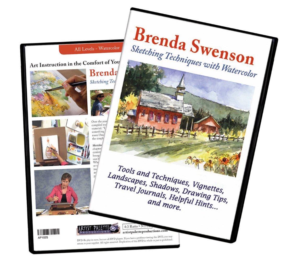
Great news...my long awaited DVD is here. The response has been wonderful and I am more than excited to have this new teaching tool. 

Here is the description of the DVD:  Sketching Techniques with Watercolors DVD with Brenda Swenson. "There is a very playful element to sketching," Brenda Swenson says in the introduction to her latest DVD entitled Sketching Techniques With Watercolor. "When I start a large painting I tend to get serious…so sketching with watercolor to me is a lot lighter and fun filled".
 
Sketching Techniques With Watercolor is comprised of nine chapters beginning with sketching tools and techniques and continuing through to sketching and painting a vignette, a flower bouquet and a church landscape. Learn how a sketch can be complete in itself, or a road map to larger studio paintings. Whether you want to improve your skills, create travel journals or take that next step as an artist, you will come away excited and inspired. This 126 minute DVD is loads of fun for a beginning artists, as well as, a great refresher course for the intermediate painter.

Brenda Swenson, a popular instructor and author, has compiled many sketchbooks that she continues to use as reference material. "I discovered early on in life, that I didn’t really see something until I drew it. The more I sketched and painted, the more I became aware of the world around me. I found that even the simple things in life took on a new importance and beauty."

If you like a copy it is available at Cheap Joe's Art Stuff. 
Here's the title and link: "Sketching Techniques with Watercolor".

Happy Sketching!
Brenda