Reference Photo
Cameras are a wonderful tool but it's important to remember photographs are simply a springboard. I don’t rely too heavily on them. The sooner I respond to what’s happening on the paper and quit looking at the photo the better off I’ll be…especially with the technique of negative painting.
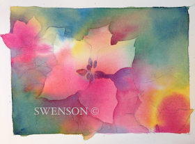
I start by drawing the poinsettias with a 2B pencil on Arches 140lb cold press paper. I'm especially aware of the space and shapes between the flowers and leaves (negative space). I want shape and size variety. I draw enough to get the general shapes, but not too much. I intentionally leave areas understated so I'll have opportunities for negative shapes to develop in the painting process.
MOTHER COLORS
I use transparent paint to build up glazes. I limit my underpainting to 3
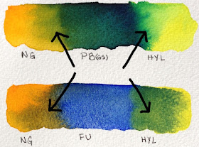
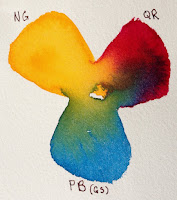
colors. To determine which 3 colors I will use I make numerous color swatches. The paints need to be the same consistency (whole milk) to encourage ample mixing on the paper. I'm looking for interesting combinations (how they mix when wet, range of colors, range of values and do they relate to my subject). The 3 paint colors I selected I call my Mother Colors: New Gamboge (NG), Quinacridone Rose (QR), and Phthalo Blue GS (PB GS).
I wet the watercolor paper with clean water and introduce the 3 paint colors separately into the wet surface. I paint at an angle to encourage mixing as the paint moves. I don’t overwork the surface with a paint brush but encourage the paint to mix and mingle on the paper. I leave a third of the paper untouched with paint. As it dries the paint will continue to move and hopefully a small amount of light/whites will remain. Let throughly dry naturally (without a hair dryer).
3: START GLAZING
I continue with my Mother Colors (original 3 colors) and I pull French
 Ultramarine into the mixing area of my palette. When I bring a new color into the mix it touches one of the original Mother Colors. Why? Having a new color touch one of the original 3 colors creates harmony in the glazing process. When I begin glazing I'll paint over some of the poinsettia petals, leaves and background at the same time. I start in the upper left hand corner and work clockwise. I paint hard edges against the petals I want to save and soften as I pull away. As I work clockwise around the main poinsettia I vary my colors slightly with the Mother Colors and French Ultramarine. Let throughly dry.
 4: GLAZING CONTINUED - GREENS
Periodically I wipe off my palette especially if the mixing area has become a neutralized mixture. Mud, neutrals or grays are wonderful and every painter should know how to mix them. But know when you want them and how these grays work to make other colors more lively.
I pull out fresh paint into the center of my palette. I have the Mother Colors (NG, QR, PB), French Ultramarine and the new addition of Hansa Yellow Light. Starting on the left side directly below the poinsettia and working counter clockwise. I use a mixture of French Ultramarine &
 Quinacridone Rose. I carve out shapes with hard edges against the petals. As I move across the lower section I want my colors to move from purples into the greens. With each brush load I slightly shift the green. Below the center poinsettia is a cooler green and pushes towards the blues. As I move across the lower section (left to right) I carve out more petal shapes. Above the far right poinsettia the greens are much warmer and have more Hansa Yellow Light. The small negative shapes in the center of each flower is a dark mixture of French Ultramarine & Quinacridone Rose. Let throughly dry.
FINAL STAGE: DARKEST DARKS, SMALLEST SHAPES & DETAILS
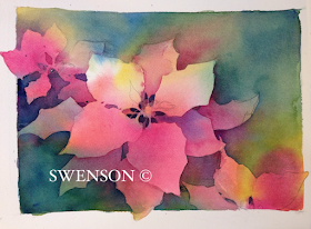
As the poinsettia turns from the light I have a variety of shadows. Form shadows have soft edges and cast shadows have hard edges. The shadows on the petals are a darker value of Quinacridone Rose with a touch of French Ultramarine as it turns from the light. When I need to soften the edge of a form shadow I use clean water on the edge before the paint has a chance to dry. The leaves beneath the center poinsettia is the darkest passage of negative painting. I use a mixture of Phthalo Blue GS & New Gamboge, before the paint has a chance to loose its shine I drop a little Quinacridone Rose into the passage. The unexpected warmth brings life to the dark greens. A few touches of color in the center of the poinsettia and it’s finished.
Hope you’ve enjoyed this short demonstration. I used the Daniel Smith Essentials Set. The set consists of six tubes of paints. A warm and cool: red, blue and yellow. The colors are VERY transparent (exception of Hansa Yellow Light which is semi-transparent).
Happy Painting!
Brenda


I loved this! What a wonderful gift you've given us. I've been following for years, and sheer layer by sheer layer I'm understanding more about how you achieve the light, softened but somehow still intense quality that characterizes your work for me.
ReplyDeleteLori, Thank you for for the thoughtful comment!
DeleteWow, this is lovely and thanks for sharing the step by step! warmly Miranda
ReplyDeleteMiranda, You're welcome!
DeleteQuick question...as you move from step 2 (underpainting) to 3 and 4 (glazing), are you rewetting the entire areas before applying the paint? Or just adding the hard edges and then with water pulling the colors out to blend in with the underpainting colors? Thanks!
ReplyDeleteJust when adding hard edges and pulling out.
DeleteVery helpful, thanks!
ReplyDeleteThank you so much for this demo. Very helpful and appreciated.
ReplyDeleteMerry Christmas Brenda to you and all your family and friends, and I wish you a Happy New Year, filled with art that feeds your soul.
ReplyDeleteMerry Christmas to you my friend!
ReplyDeleteHi Brenda,
ReplyDeleteI am somewhat a beginner having done painting for the last 4 years. I love what you do and I would like to follow your demonstrations and produce some paintings. If something is successful can I sign it or would that be a breach of copyright?
Thank you for asking. The image and steps I've shared are for educational and demonstration purposes. You may use the images provided for that (to study). The copyright infringement or plagiarism enters when you sign or sell artwork. Signing artwork says, this is my original idea, concept and artwork (which it isn't). So you may use the information provided to learn and study the technique but don't sign or sell the image.
DeleteAs you grow as an artist you will want to call pieces of artwork yours. For that reason I highly recommend you only use photo references that are your own or you have written consent to use.
I've seen professional artists stripped of awards and honors from prestigious shows for using photos without permission. It's a huge black mark on their reputation personally and professionally.
Thank you very much for your advice. I will certainly bear that in mind.
DeleteI don't see the photographs any more. I've tried on 3 different devices. Is there a problem.
ReplyDeleteGlenn X, Thanks for letting me know. I don't know what happened. I have to redo the page. I'll repost again...as a new post. Please check back.
DeleteThanks!
This comment has been removed by the author.
ReplyDeleteYou are very talented! It was fun to paint along with you for my 2nd negative painting watercolor. It was a bit hard to stop adding color, every stroke added to the color. Thank you for posting and keeping it available!
ReplyDeleteYou’re welcome😁
ReplyDelete